

DONOBUENO
Donovan Donnell
Lead UX designer & Researcher
game go now / case study
My Responsibilities:
-
Competitor Research & User Research
Facilitation of In-Person Moderated Usability Study -
Implementation of all Design iterations.
Creation of: Wireframes, Lo/Hi Fidelity Prototypes
responsive website

Project Overview
The Product:
A Gaming Website that hyper focuses on getting gamers with a tight budget, the best gear.
Project Duration:
February 2024 - In Progress
The Problem:
College Gamers or recent college graduates gamers were unable to acquire top quality gaming gear due to budget restraints
The Goal:
Create a website that offers gamers Alternate ways to pay for , pay against or pay less for high end gaming gear.
User Research:
Pain Points
Summary:
I conducted in person interviews with College aged (16-24) gamers to inquire about their “desire for” vs “ability to” acquire high end gaming gear.
Although this is the prime user group for gaming > I went into this study ignorant of how tight the budget would be for this specific demographic. I found that these users are not typically in the workforce making money: due to the “time investing” demands on gamers who are also active students or because job market is very competitive for recent graduates looking for work in the tech industry. After my research i found that this user group had a very profitable skillset & knowledge base that many of the gear providers needed. The Gaming gear providers need their tech reviewed, advertised & promoted; a service they would normally have to pay an experienced gamer for. This user group would be the ideal Ambassadors for this type of work. This created an alternate payment option opportunity for gamers on a tight budget.
01
Can't Afford Gear
Make Alternate pay options very visible on website.
03
No Time to Earn $
Make becoming an Ambassador a simple & quick 1 or 2 page design.
02
Which Gear is Best
Make user reviews available on website.
04
Lack Of Community
Build a “Team” function into the theme of the website.
Persona: Denim
Denim is under 18 & lives with a lot of supervision & input from Adults who don't understand gaming. There is no real support system for their passion nor revenue stream.
Age: 16
Education: Some College
Home: San Diego, Ca
Family: 2 Parents & 1 Sibling
Job: Full-Time Student
Problem statement:
Denim is a teen Gamer who needs equipment that is affordable & reliable, accepts trade-ins or has payments plans because they only get allowance.

“Gaming is the best part of my day. I wish i had more time & money to do it.”
Frustrations: The best tech is out of my financial reach.
Goals: Purchase more high-end Gaming Equipment.
User Journey Map
Showcasing a partnership or discount option on the home screen. This will immediately excite hope & identify the sites intentions to meet the needs of gamers on a tight budget. Make signing up quick w/ easy to understand terms.
Site Map
Strategic to place SHOP & PARTNER at top left to quickly offer the sites premier services. Easy access to Profile to see their perks & status & Cart to see their purchases helps to expedite their user experience & keep them from getting lost on the site & wasting valuable time.
Paper Wireframes
We saw through the initial iterations that the aim / intent of the site could easily be lost in the clutter of Design Decor. So a more minimalist approach was chosen > with a pronounced focus on visual cues.


Digital Wireframe

Digital Wireframe
screen variations

The goal in transitioning screen sizes is to always keep the focus on the “pronounced visual prompts” that are intended to drive users to the premier benefits of the site. Using the Gestalt Principles made it very easy to accomplish that goal.
Usability Study
Study Type: In-Person Moderated
Location: Los Angeles, CA (Home)
Participants: 5
Length: 20 - 30 min
Findings 1
Findings 2
Findings 3
Home page to busy
no space for preferred pronoun
When are Discounts Available?
Usability Study Results Iterations
Findings 1
iteration
Findings 2
iteration
Findings 3
iteration


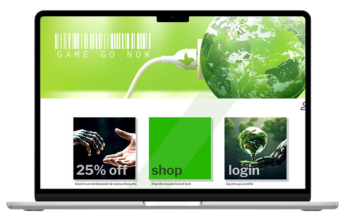
The use of *Cards was implemented to stay within the brands Visual specifications while also enhancing the user journey by providing clarity & ease of initial call to action.
On the Online form page, a box next to age was provided for user to further identify. This better aligns the site with the Teamwork / Community Brand they are aiming for > ensuring their users feel seen & supported.
Upon exiting the *Congratulations for signing up page - the "close page" X > leads the user directly to their newly created profile where they will immediately see the most updated status of their discount eligibility.
Hi-Fidelity Prototype
The Goal is to sign up for the ambassador program to enjoy the discounts.
1. select the 25% off
2. Join
3. Submit
4. Exit welcome Screen


Sticker Sheet
ACCESSIBILITY CONSIDERATIONS
1. High Contrast
2. Heading Hierarchy (H1, H2, H3)